The design challenge details can be found at DigitalGov.gov.
I analyzed a number of non-English inforgraphics for both print and web in order to determine which ones felt friendly and why.
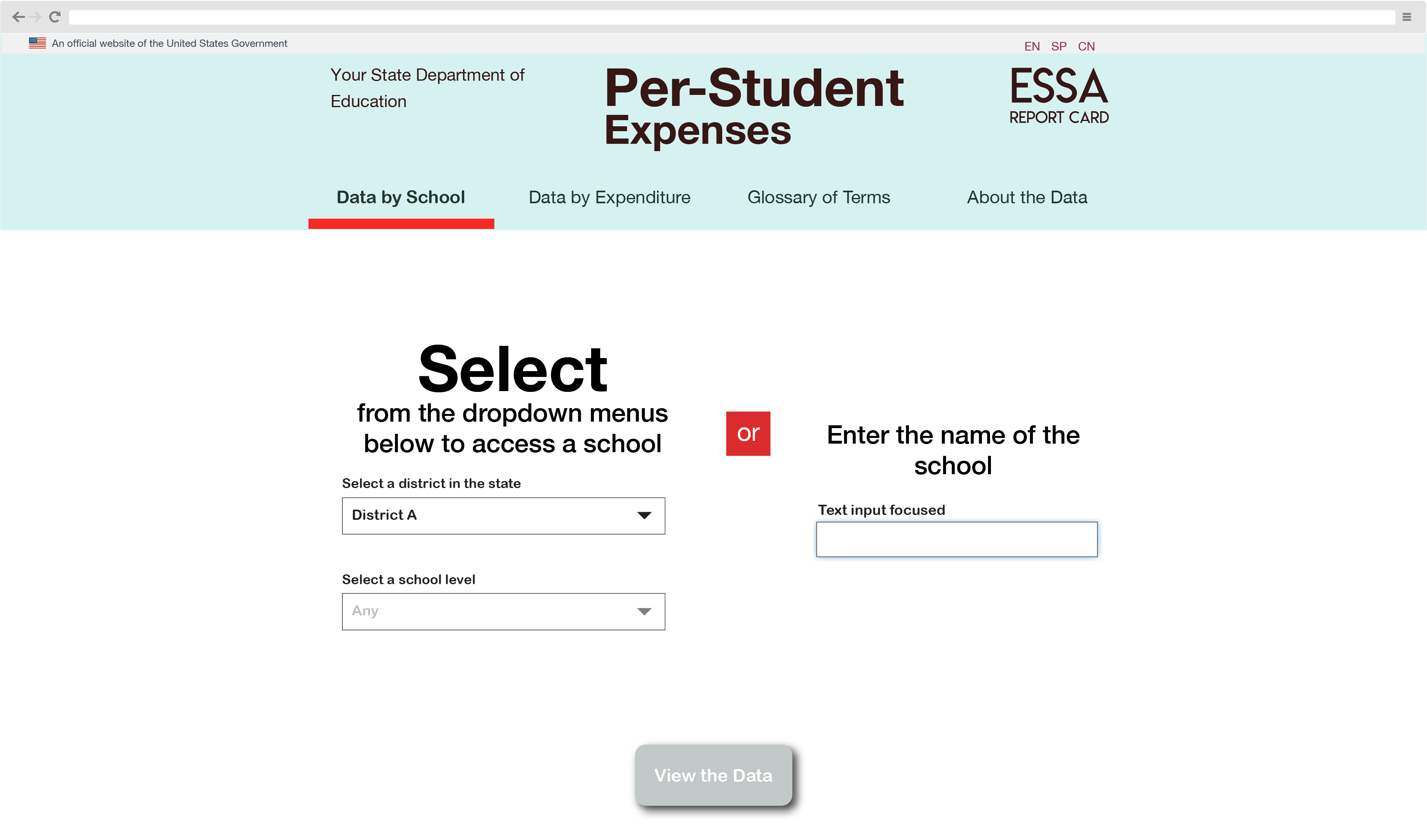
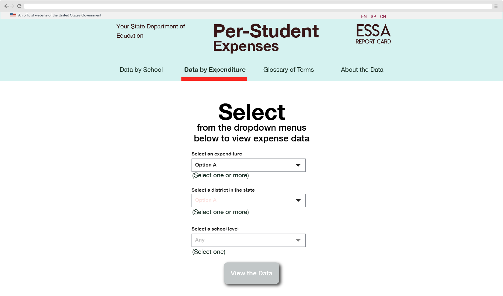
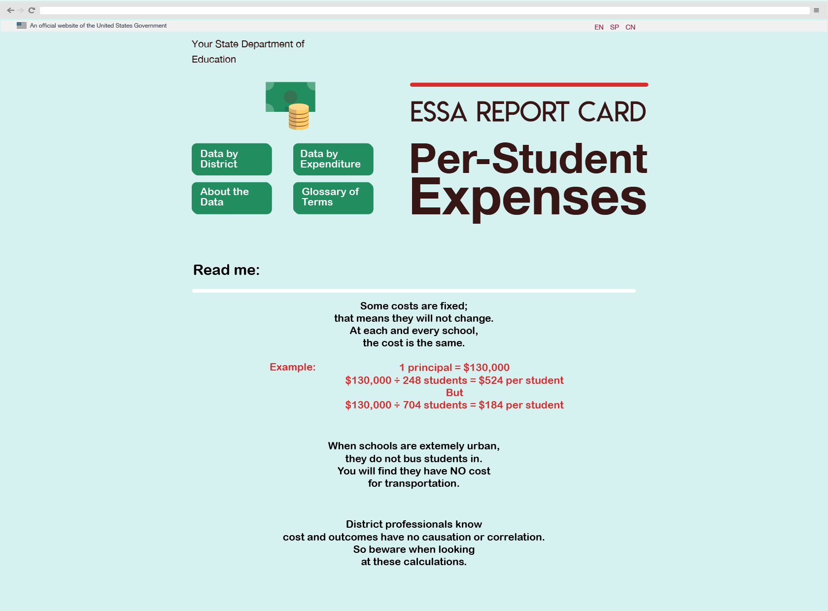
In order to project a friendly feel, I used secondary and tertiary colors. I tested primary colors, such as blues, and found them to be to stark, rigid and cold.
Since this was for a government site, I wanted to take advantage of the good, open-source design components provided by the US Web Design System because they have already proven to be critical time-savers.
…not as easy as one would think given the time constraint and three sets of stakeholders – and one of which had very louche goals.
Two days after the challenge was over, my mind was still tingling with ideas. So the final mockups are really cheating the challenge: